
同时发布于 语雀
引子
最近公司在搭建部门的统一平台,我负责了统一登录前端的开发,因为要对接很多的系统,所以开发了统一登录的 sdk,说是 sdk 其实就是一个组件库。以此为契机,外加之前开发其他的系统中也用了很多种不同的组件库(饿了没-ui/vant/antd/chakra-ui...),今天写一篇文章说说,什么样的组件设计是比较合理的,以及如何设计一个好用的组件。
研究 chakra-ui
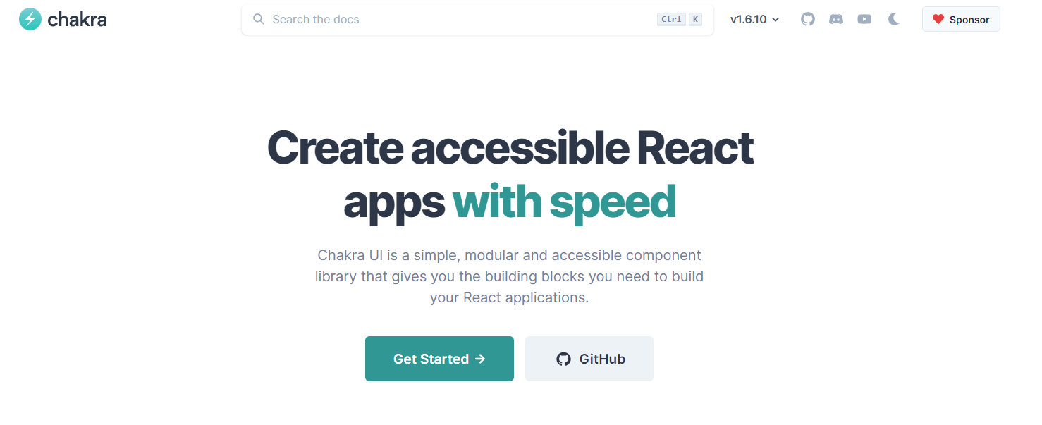
比较来说我觉得设计比较有特色的一个组件库,就是 chakra-ui 了,不过国内使用的并不多,我也是在之前技术选型的时候偶然找到的,但是仔细读了她的文档之后我发现这个是一个很有特色的组件库,下面细说:
样式自定义
找到这个 chakra-ui 的时候,就是因为需要在使用 tailwind CSS 的同时使用一个组件库,chakra-ui 的一个特色就是使用了和 tailwind CSS 几乎相同的样式 api , 例如:
import { Box } from "@chakra-ui/react"

// m={2} refers to the value of `theme.space[2]`
<Box m={2}>Tomato</Box>

// You can also use custom values
<Box maxW="960px" mx="auto" />

// sets margin `8px` on all viewports and `16px` from the first breakpoint and up
<Box m={[2, 3]} />
这样只要你记住了 tailwind CSS 的 api, 那么就可以很快的上手 chakra-ui 。 那么这个是怎么实现的呢? 一开始我以为是组件库使用了 tailwind CSS ,但是看了源码发现,chakra 将 styled-components 进行了二次封装,而这种 tailwindLike 的 api 是进行了模拟导致的。 在 /packages/styled-system/config/ 里面 写入了不同样式以及缩写,以 background 为例:
export const background: Config = {
  background: t.colors("background"),
  ...
  bg: t.colors("background"),
  ...
}
这样实现的,可以说把 dirty 的工作封装了起来,展示出来的结果都是好用的。
组件组合
书接上文,组件里面做了很多的映射封装,为了减少代码量,统一进行管理,组件库进行了组件的组合(compose)。从一个基本的组件出发,通过默认一些样式,创造了一些新的组件。 例如 Square Circle 组件,是基于 Box 组件 extend 而来的。
export const Square = forwardRef<SquareProps, 'div'>((props, ref) => {
  const { size, centerContent = true, ...rest } = props;

  const styles: SystemStyleObject = centerContent
    ? { display: 'flex', alignItems: 'center', justifyContent: 'center' }
    : {};

  return (
    <Box
      ref={ref}
      boxSize={size}
      __css={{
        ...styles,
        flexShrink: 0,
        flexGrow: 0,
      }}
      {...rest}
    />
  );
});

if (__DEV__) {
  Square.displayName = 'Square';
}

export const Circle = forwardRef<SquareProps, 'div'>((props, ref) => {
  const { size, ...rest } = props;
  return <Square size={size} ref={ref} borderRadius="9999px" {...rest} />;
});

if (__DEV__) {
  Circle.displayName = 'Circle';
}
这样写减少了重复的代码并且可以保持更好的可维护性。我们在开发的过程中也可以借鉴这种模式,开发出最抽象的组件,从这个最抽象的父类出发来进行派生。
Theminig
chakra ui 的另外一个特点就是拥有一个高度自定义的主题系统, 使用的方式类似于 tailwind CSS 设置,也就是说你可同时将一个 theme 文件应用到两个库中,使用方法可以看一下chakra 文档,那么这个主题是如何实现的呢?
首先 chakra ui 维护了一个 default theme ,用于在没有自定义 theme 或者 自定义了一部分的 theme 的时候进行合并,合并的过程(toCSSVar)是使用了 createThemeVars 方法将自己配置的 theme 转化成 css var 变量,然后将默认的 theme 和生成的 theme 进行合并。最后在 :
export const ThemeProvider = (props: ThemeProviderProps) => {
  const { cssVarsRoot = ':host, :root', theme, children } = props;
  const computedTheme = React.useMemo(() => toCSSVar(theme), [theme]);
  return (
    <EmotionThemeProvider theme={computedTheme}>
      <Global styles={(theme: any) => ({ [cssVarsRoot]: theme.__cssVars })} />
      {children}
    </EmotionThemeProvider>
  );
};
这里是借用了 emotion 的 ThemeProvider。这么一看其实主题设置还是很简单的。这样可以很方便的设置了一个自定义的主题 除此之外,如果想在二次开发的主题上进行三次开发,可以使用 chakra-ui 提供的 api Theme extensions。提供了一个类似于 HOC 的包裹函数,以 withDefaultColorScheme 为例:
export function withDefaultColorScheme({
  colorScheme,
  components,
}): ThemeExtension {
  return theme => {
    let names = Object.keys(theme.components || {});
    // ....
    return mergeThemeOverride(theme, {
      components: Object.fromEntries(
        names.map(componentName => {
          const withColorScheme = {
            defaultProps: {
              colorScheme,
            },
          };
          return [componentName, withColorScheme];
        })
      ),
    });
  };
}
将配置的颜色 Scheme 赋值给了配置的对应的组件。内部实现大同小异,都是调用了 mergeThemeOverride这个方法
export function mergeThemeOverride<BaseTheme extends ChakraTheme = ChakraTheme>(
  ...overrides: ThemeOverride<BaseTheme>[]
): ThemeOverride<BaseTheme> {
  return mergeWith({}, ...overrides, mergeThemeCustomizer);
}
内部使用了 lodash.mergewith的方法实现融合,对于此方法 chakra-ui 写了一个 mergeThemeCustomizer 作为 lodash.mergwith 的第三个参数,这里的自定义 mergeThemeCustomizer 方法使用了递归的方式进行 merge。
function mergeThemeCustomizer(
  source: unknown,
  override: unknown,
  key: string,
  object: any
) {
  if (
    (isFunction(source) || isFunction(override)) &&
    Object.prototype.hasOwnProperty.call(object, key)
  ) {
    return (...args: unknown[]) => {
      const sourceValue = isFunction(source) ? source(...args) : source;

      const overrideValue = isFunction(override) ? override(...args) : override;

      return mergeWith({}, sourceValue, overrideValue, mergeThemeCustomizer);
    };
  }

  // fallback to default behaviour
  return undefined;
}
外部组件与二次封装
从上面可以看到,组件库也不是全部从零开始,也使用了很多第三方的库,例如样式库 emotion, styled-components,工具方法库 lodash,这里没啥特别好说的。 另外 chakra-ui 官方也推荐将组件库和许多第三方的 lib 一起使用,例如 表单验证库formik,此外,在 element-ui 中也会直接封装 throttle-debounce, async-validator 等第三方的库。
提供 escape
在使用其他的组件库的时候,很多情况下会出现某些组件的细节和设计要求不一致的情况,对于 element-ui 和 ant design 来说,由于使用了 sass/less 等预处理器,可以使用覆盖的方式来覆写样式。在 chakra ui 中,则提供了一个 sx Props 来直接向组件传入样式。
<Box sx={{ '--my-color': '#53c8c4' }}>
  <Heading color="var(--my-color)" size="lg">
    This uses CSS Custom Properties!
  </Heading>
</Box>
这个方式很强大,还支持嵌套样式,media query 等。这里的 sx 是一个封装自@emotion/styled 的方法,在 packages/system/src/system.ts, styled 方法里面调用了 toCSSObject ,这里拿取到了输入的样式,而所有的 ui 组件都会调用这个 styled 方法,sx Props 就这样全局生效了。
export function styled<T extends As, P = {}>(
  component: T,
  options?: StyledOptions
) {
  const { baseStyle, ...styledOptions } = options ?? {};
  // ...
  const styleObject = toCSSObject({ baseStyle });
  return _styled(
    component as React.ComponentType<any>,
    styledOptions
  )(styleObject) as ChakraComponent<T, P>;
}

export const toCSSObject: GetStyleObject =
  ({ baseStyle }) =>
  props => {
    const { theme, css: cssProp, __css, sx, ...rest } = props;
    const styleProps = objectFilter(rest, (_, prop) => isStyleProp(prop));
    const finalBaseStyle = runIfFn(baseStyle, props);
    const finalStyles = Object.assign(
      {},
      __css,
      finalBaseStyle,
      styleProps,
      sx
    );
    const computedCSS = css(finalStyles)(props.theme);
    return cssProp ? [computedCSS, cssProp] : computedCSS;
  };
如何设计一个好用的组件
参考了很多设计,那么如何设计一个好用的组件呢,这里以一个 progressBar 为例。
MVP 版本以及存在的问题
import React, { useState, useEffect } from 'react';
import styled from 'styled-components';

const ProgressBarWrapper = styled.div<{ progress: number }>`
  width: 100%;
  height: 4px;
  position: fixed;
  top: 0;
  left: 0;
  right: 0;
  z-index: 9999;
  .bar-used {
    background: #34c;
    width: ${({ progress }) => progress + '%'};
    height: 100%;
    border-radius: 0 2px 2px 0;
  }
`;

const ProgressBar = () => {
  const [progress, setProgress] = useState(0);
  useEffect(() => {
    window.addEventListener('scroll', () => {
      setProgress(
        (document.documentElement.scrollTop /
          (document.body.scrollHeight - window.innerHeight)) *
          100
      );
    });
    return () => {
      window.removeEventListener('scroll', () => {});
    };
  });
  return (
    <ProgressBarWrapper progress={progress}>
      <div className="bar-used"></div>
    </ProgressBarWrapper>
  );
};

export { ProgressBar };
这里展示了一个页面顶部进度条的组件,类似于 es6 标准入门 这里的样式,上面的功能可以很快的就实现出来,但是只是比较符合单一的应用场景,进度条固定在顶部,只有从左往右增长一种情况。但是实际上的进度条可能会用到很多的地方,因此我们需要对照可能的场景以及代码中的变量进行判断,哪些是需要做成参数,并设置对应的默认值。 需求有以下几种:
- 颜色可调,位置可调,方向可调,这三个是比较全局的可调整类型
- 具体样式修改,高度修改,圆角修改,这些是其他的一些 props,如果保持 progressbar 的功能不变可能不太会用到的 props
此外,这里的 progeressBar 还存在的一个问题就是,这个组件将展示和逻辑杂糅在了一起,组件内部就有对于页面滚动进度的计算逻辑(useEffect),但是如果使用的时候不需要这个逻辑呢? 根据上面的一些要修改的点以及一些问题,我们来对这个组件进行拆分和重构。
重构
首先是把逻辑和展示分开。新建一个 hook 用于计算百分比。
import { useState, useEffect } from 'react';

export function useProgress() {
  const [progress, setProgress] = useState(0);
  useEffect(() => {
    window.addEventListener('scroll', () => {
      setProgress(
        (document.documentElement.scrollTop /
          (document.body.scrollHeight - window.innerHeight)) *
          100
      );
    });
    return () => {
      window.removeEventListener('scroll', () => {});
    };
  });
  return progress;
}
之后是给需要的参数添加 props,并设置默认值,这里只以高度为例,设置一个可选的高度参数,当传入的时候就使用传入的值否则是默认的。 同时注意颜色等可以使用一个 theme 系统。
const ProgressBarWrapper = styled.div<{ progress: number; height?: string }>`
  width: 100%;
  height: ${({ height }) => (height ? height : '4px')};
  .bar-used {
    background: ${({ theme }) => theme.themeColor};
    width: ${({ progress }) => progress + '%'};
    height: 100%;
    border-radius: ${({ height }) =>
      height ? `0 calc( ${height}/ 2) calc(${height}/ 2) 0` : '0 2px 2px 0'};
  }
`;
除此之外,将 fixed 布局抽象出来,方便后面进行组合
const FixedTopWrapper = styled.div`
  position: fixed;
  top: 0;
  left: 0;
  right: 0;
  z-index: 9999;
`;
// 组合之后就是这样的
const ProgressBarWrapperFixed = styled(FixedTopWrapper)<{
  progress: number;
  height?: string;
}>`.....`;
这样组件就是这样的,分成了默认好用的 ProgressBar 和 自定义功能更多的 SimpleProgressBar
interface ProgressProps {
  progress: number;
  height?: string;
}
const ProgressBar = ({ height }: Omit<ProgressProps, 'progress'>) => {
  const progress = useProgress();
  return (
    <ProgressBarWrapperFixed progress={progress} height={height}>
      <div className="bar-used"></div>
    </ProgressBarWrapperFixed>
  );
};

const SimpleProgressBar = ({ progress, height }: ProgressProps) => {
  return (
    <ProgressBarWrapper progress={progress} height={height}>
      <div className="bar-used"></div>
    </ProgressBarWrapper>
  );
};
另外就是添加 合适的 escape,方便使用的时候如果不符合需要可以自行修改。这里直接在组件上添加一个 style 参数,
// usage
<ProgressBar style={{ background: '#000' }}></ProgressBar>;
// 修改组件 添加rest参数接受附加的style,并且修改一下类型
const ProgressBar = ({
  height,
  ...rest
}: Omit<ProgressProps, 'progress'> & React.HTMLAttributes<HTMLDivElement>) => {
  const progress = useProgress();
  return (
    <ProgressBarWrapperFixed {...rest} progress={progress} height={height}>
      <div className="bar-used"></div>
    </ProgressBarWrapperFixed>
  );
};
这样就写好了一个好用的 ProgressBar 组件了,并且提供了 SimpleProgressBar 用于其他的自定义用途。
在线演示:https://codepen.io/alfxjx/pen/ZEJyygo?editors=0010
总结
经过上面对 chakra ui 组件库源码的研究以及一个示例,相信你以及知道了该如何设计一个好用的组件库了,希望你能为你的公司也开发一套组件库,能更好的完成你的 kpi/okr/etc...